
Is this a book review? Is it a humor column? Is it an artsy "how to"? No. It's just one of my pre-migraine days where too many lights / sounds / scents are really agitating. And -- fabulous me! -- I'm bringing you along for the ride.
Since people, television and sunlight are all making me queasy, this sort of day is perfect for flipping through old stacks of art books for learning opportunities. Bookish, you say? Perhaps. Boring as dried toast? Maybe in general. But not today! Today's lesson is the love child of Paris Hilton and Gene Simmons, and Emeril Lagasse is its au pair. Today we let Mike Svob and his (hilariously titled) book "Paint Red Hot Landscapes That Sell!" show us why we aren't rich, famous, and up to our unmentionables in meaningless one night stands!
Practice along with us, with an exercise taken from Mike's book!
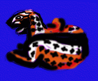
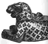 Select a study photo. A different art book I read recently said "don't pick a crappy pix, dumb@ss, u suck too much as it is". So of course I rushed right out and picked a reference that, as a sample of photography, is just okay. This wasn't meant to be an amazing photograph. It was meant to clearly reproduce an amazing work of art without getting in the way. But I simply love the leopard, with his angry, googly eyes. I went with this as a reference photo anyway. Screw it.
Bronze leopards inalid with gold, unearthed from the tomb of Liu Sheng. Photo from "The Chinese Exhibition: A pictoral record of the Exhibition of Archaeological Finds of the The People's Republic of China" publication put out by the Nelson Gallery-Atkins Museum of Kansas City, Missouri in 1975.
-
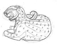 Step 2 is to make an outline drawing. Never mind the humble start, I am on my way to being the next Thomas Kincaide! (But redder hotter.)
 - Start with the darks. Let me point out here that I don't actually like Mike's art. His color schemes and compositions unsettle me and his topics make me vaguely cranky. Even if I have a mild dislike of his art, though, I love his approach to painting.
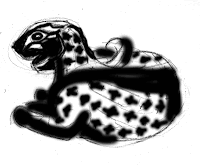
His work has a coked-out, arrogant rock star feel to it. "Ignore the color and small tonal value changes," Mike says. The ignorant, mouth-breathing, "I like this because it matches my couch" masses aren't capable of understanding nuance anyway. Just slap your darks on! Because (with the help of this book) you are Red Hot. Look at my practice image! Darks! I am red hot! - The glaze and the middle value. Mike's example was screeching magenta, but he's doing landscapes. (SEXY landscapes.) Landscapes are green. They favor a contrasting red color. I'm doing a ... well, a black and white leopard. Leopards are orange, right? Picture a color wheel in your mind. Perhaps tatooed on a bronzed Calvin Klein model. Look across the color wheel -- somewhere past the external obliques, perhaps simmering on the transversus abdominis -- to see what the complement to orange is. We go with blue!
Hm. It occurs to me that a leopard is not a landscape. Will this affect the outcome? 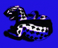 Re-establish the lights with opaque paint. Mike is painting with, uh... gessos and acrylics? Some sort of real, red hot, artist implements! I bet Mike rocks a sexy artist smock, too, which he removes only to service groupies. I don't have groupies. Or acrylics. I'm using GIMP and I had to rearrange my layers to make this work:
- Bottom - line art.
- Next up, glaze layer of solid color. (Set it to "multiply", kids at home, so it doesn't hide your line art.)
- Up top, the layer with the darks.
Also I forgot to save step four, so you've only got one picture for steps 4 and 5. I know. You're devastated. The mystery! What DID it look like when I added the blue but hadn't yet added the white? You will never know, couch-matchers.- Re-establish the lights with... WAIT. Steps 4 and 5 were the same in Mike's book, too. What the hell. This doesn't go with my couch at all.
 "Now introduce different color temperatures." He had all hots (RED hots!) and I've got all cools, so I guess I need to sex up my image with some oranges and reds and stuff. I have named this layer "panty dropping warm tones". I believe any commercially successful artist will understand.
- "Finish up by painting in all the shapes that remain." What the...? Isn't that a little like handing someone a block of wood and telling them to carve away anything that doesn't look like an elephant? I guess if I could learn to do this, I could learn to paint red hot landscapes. That sell.
I'm not real wild about the end result. Mine is actually not so very different than Mike's. They both look a little bit like a kindergartener ate a few brightly colored crayons, then threw up in the playground after the wax clashed with the cafeteria food. Maybe an artistic kindergartener. But Mike's practice piece for this session is much rougher than his normal works, too. The whole point is this is practice.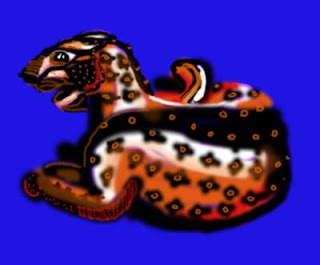
This was actually a really fun way to play with shapes and lights and darks, with some sexxxay color thrown in. I learned a lot and enjoyed the crap out of myself. And if this wouldn't look good in your living room, it's because you needed new furniture anyway. Because, thanks to Mike Svob, I am red hot, baby.


The Piker Press moderates all comments.
Click here for the commenting policy.