
I have seven colors of ink for my fountain pens. This is on the verge of turning into a hobby in its own right and I feel this is the last point I can stop it before it takes a life of its own. I am not actively collecting pens at the present time. Yes, you can get an inexpensive one for twenty dollars or so, but Chalmers Wallace has no interest in such pens. No, the ones that strike his fancy start at something over a Ben Franklin and go up from there. Ink, therefore, would seem to present a more attractive direction as an outlet.
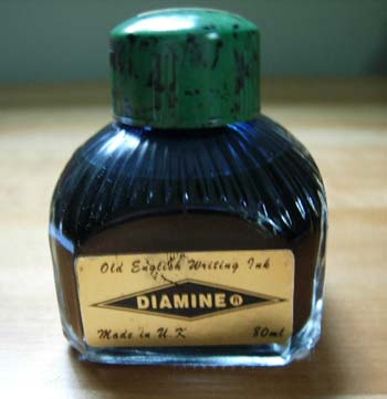
I was in Manhattan on Friday and at the suggestion of a friend stopped by Art Brown. They are a very nice store on 45th street that specializes in fountain pens and ink, and paper. I walked in, ready for a bit of a rest after walking across Central Park, up to the Met, and down to 45th. While there I bought two bottles of ink. The one I'm going to tell you about here is Diamine, "Blue Black."
From the Diamine website: "Ink Manufacturers since 1864 Diamine Inks relocated to this purpose built 'state of the art' factory in Liverpool in 1925, where they successfully carried on using the traditional methods and formulas for ink production. Over the years the company was taken over many times and relocated yet again, but throughout the DIAMINE TRADE MARK and production methods survived symbolising the finest quality in Fountain Pen Inks, Calligraphy Ink, Drawing Ink and Writing Inks."
I got this ink, in part because I was in search of the perfect blue black. What is that? More black than blue, but enough blue to leave no doubt, not too much saturation as it needs to have a slightly translucent quality. I'll know it when I see it. The idea behind a blue ink, rather than just black, and beyond the simple preference for blue, is that it becomes an easy matter to tell your original from a copy. Chalmers admits this really isn't an issue with him, and at this point will further admit that the whole path of buying more and more ink is, very much frivolous.
I'm no expert here and in fact by my own admission am a complete novice. I am enjoying though, for the moment, learning on my own by testing ink a bottle at a time. This would be much more fun and proceed much more quickly if I wasn't shelling out real money for each of these bottles. Perhaps one of these fine companies will see fit to make a donation so I can ramp up the pace here?
Ink bottles are an art form unto themselves and this one is no different. It is distinctive enough to sit on any desk and stand out as something of quality that is at once utilitarian but with enough pleasing lines and color to catch you eye. It has a bit of an 19th century look to it that I find most pleasing. I contrast this with say Levenger, or Private Reserve that is almost completely modern in form. Fountain pens are old school so having the ink bottle match up in appearance is rather pleasing.
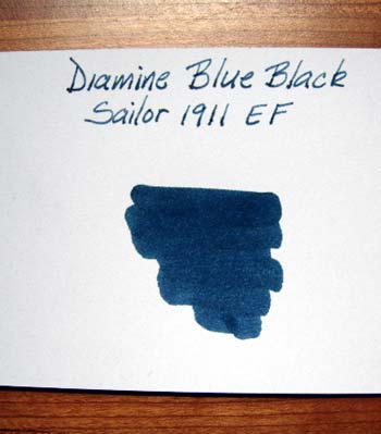
The ink itself is very pleasing though it is decidedly more blue than black. I like the saturation of this ink. It's near perfect for my tastes. I'm not sure what to call it here, but the ink does pool a bit when I make a line, like water flowing down a newly made ditch. This causes parts of each letter to be darker than another. Is this because the ink is too thin, or not mixed well? I'm not sure. This perhaps should bother me but I admit it does not. This ink feels like it would be an excellent every day ink, and I would make it so, and may, but I really am searching for something with just a bit more black. I will therefore continue with my testing and writing up my reviews here until I either come across the perfect color, or I have reviewed every ink on the market. Understand there is a wide wide range of colors on the market so for now we are focusing our attention on just the blues and blacks.
09/22/2010
07:02:55 PM